
Branding
What would it look like to personify your brand?
Blue Apron
Blue Apron delivers pre-portioned meals with step-by-step instructions right to your door. After cooking with the highest quality ingredients you'll be a better chef than you thought. With all of this at your fingertips there's no reason to eat out, because now home is your favorite restaurant.*
Art Director: Emily Olson Copywriter: Lauren Pruitt
*The following is all student spec work, it was not implemented by the brand.
tv


out of home
Social Media

Applegate Identity & ad Campaign
These days, life gets crazy keeping track of everything. The food you feed your kids should be one less thing to worry about. Applegate makes natural, delicious deli meats and hotdogs with no weird additives or fillers. It's simple food that mothers want to serve their kids. Life's complicated, your food shouldn't be.
Art Director: Emily Olson Copywriter: Wes Andrews
logo study
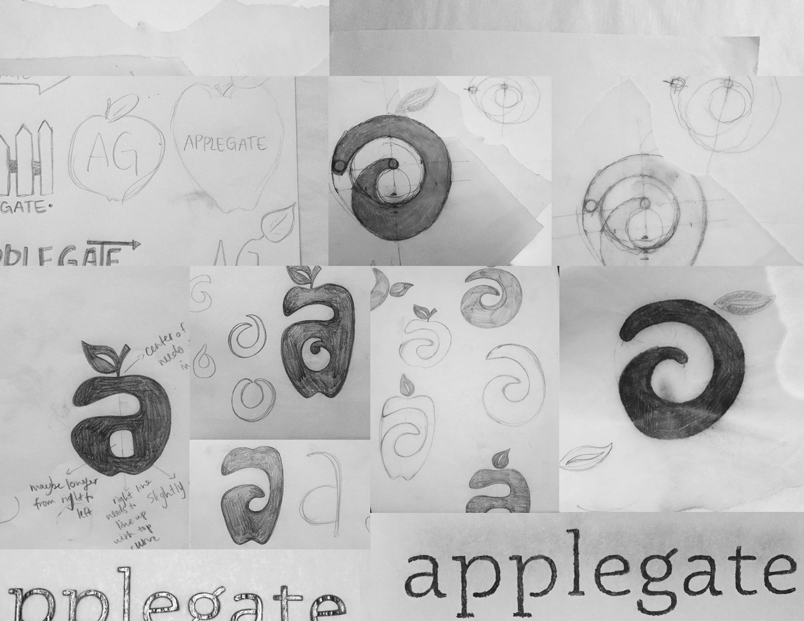
Process
The new logo more clearly reflects the brand's simplicity by using one stroke to imitate the red apple shape, as well as a lower case, cursive "a". The natural curvature represents energy, effortlessness and perpetual motion, all things a mother values.
The rounded typeface mimics the logo, pairing the two seamlessly.
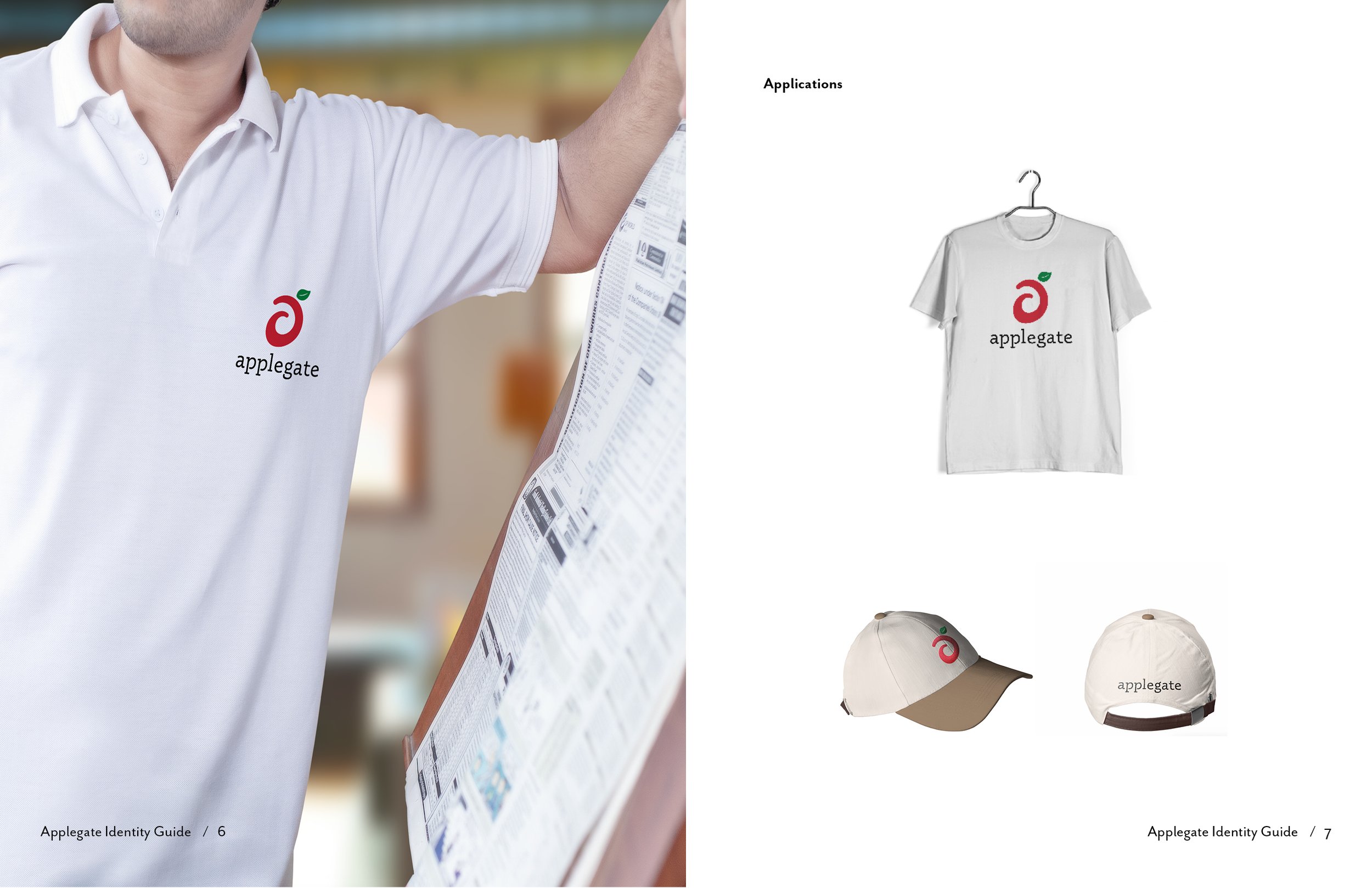
identity guide


packaging
The packaging is produced with natural, unbleached cardboard and soy-based ink.
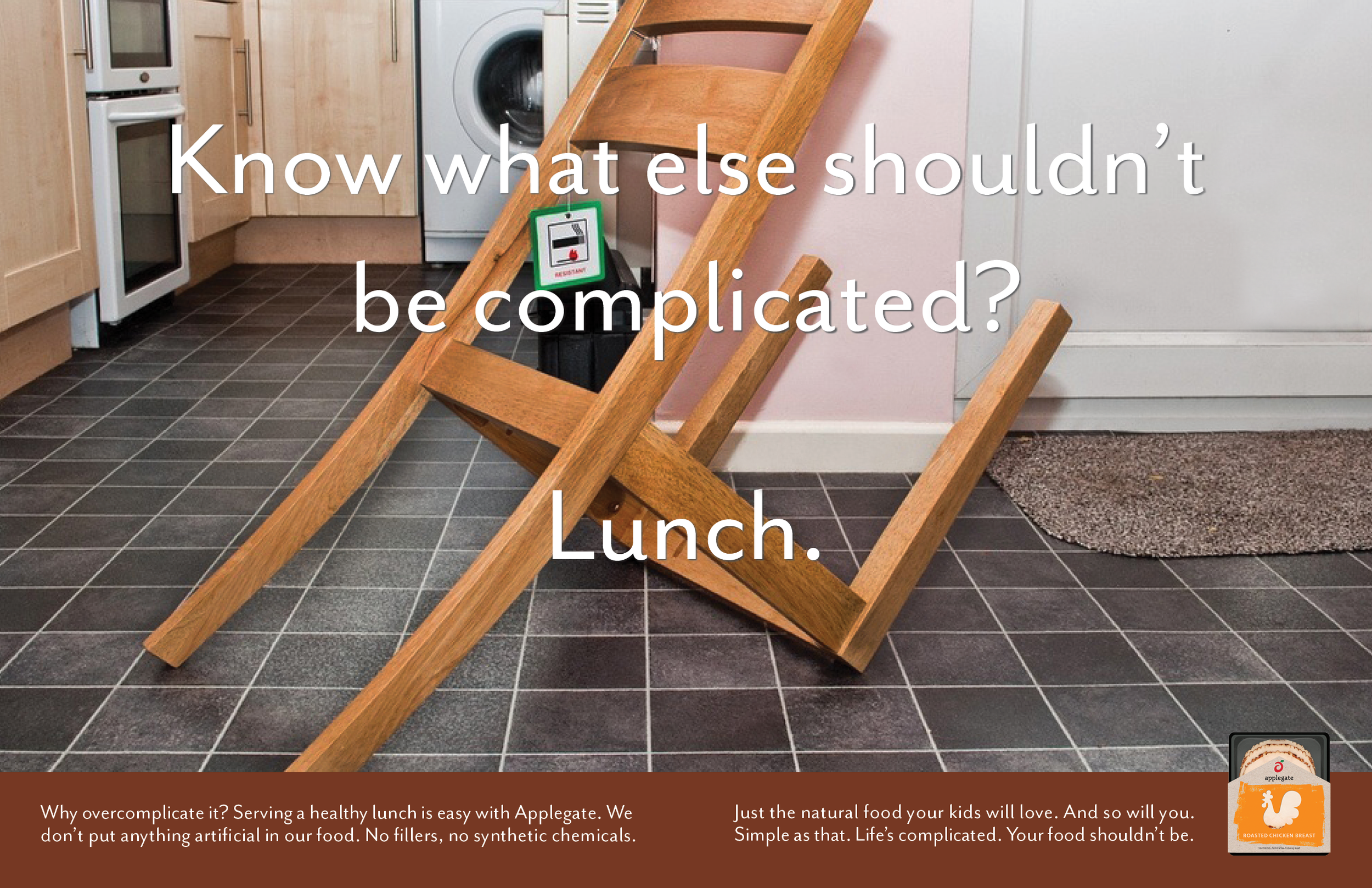

advertisments